

HTML preview & responsive testing
The HTML preview
Section titled “The HTML preview”When you open a captured message, the HTML tab renders its markup in an isolated frame — a browser rendering of the HTML your app sent, not a simulation of any specific email client. Preview responsive layouts here, then pair it with the HTML & CSS compatibility check below to flag email-client compatibility issues before an email ever goes out for real.
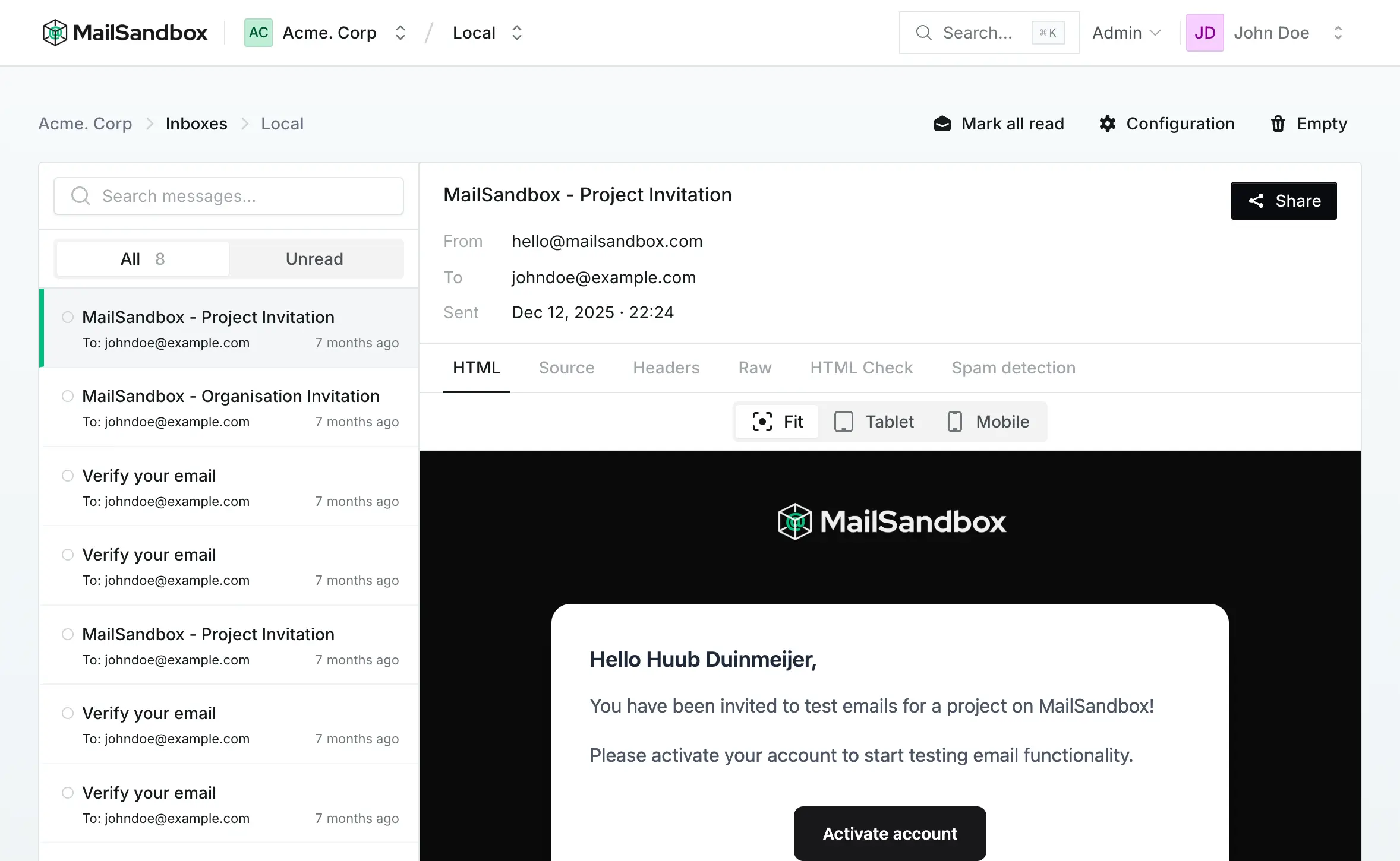
Alongside the preview you can inspect the source, headers and raw message, run the HTML & CSS compatibility check, and check the spam score.
Responsive widths
Section titled “Responsive widths”Emails are read everywhere, so the preview lets you switch the viewport width to check your responsive design:
- Fit — scales the message to fit the available space
- Tablet — renders at a tablet-sized width
- Mobile — renders at a narrow phone width, where most email is opened
Switching widths triggers your media queries, so you can catch layouts that break on small screens before your client does.